|
SOMbrero Web User Interface (v1.2)Welcome to SOMbrero, the open-source on-line interface for self-organizing maps (SOM).This interface trains SOM for numerical data, contingency tables and dissimilarity data using the R package SOMbrero (v1.2-3). Train a map on your data and visualize their topology in three simple steps using the panels on the right. |


It is kindly provided by the
SAMM team and the
MIA-T team under the
GPL-2.0
license, and was developed by Julien Boelaert,
Madalina Olteanu and
Nathalie Vialaneix, using
Shiny. It is also included in the
R package
SOMbrero. Its source code
is freely available on github:
git clone https://github.com/tuxette/sombrero.git
References:
The interface can be tested using example data files for the numeric, korresp and relational algorithms (download these files on your computer and proceed).
Once your dataset is loaded, you can train a self-organizing map (SOM) and explore it. You can then download the resulting SOM in .rda format (you will need R and the package SOMbrero to open this file and use the SOM; its class is the 'somRes' class, handled by SOMbrero). You can also explore it using the next panels to visualize the results, compute super-classes or combine it with additional variables.
Consult the "Help" panel for information on how to choose adequate parameter values.
Show advanced options
Advanced options
(1) SOMbrero is based on a stochastic (on-line) version of the SOM algorithm and thus uses randomness. Setting a seed results in fixing the random procedure in order to obtain reproducible results (runing several times the process with the same random seed will give the same map). More information on pseudo-random generators at this link .
Plot the self-organizing map
In this panel and the next ones you can visualize the computed self-organizing map. This panel contains the standard plots used to analyze the map.
Options
In this panel you can group the clusters into 'superclasses' (using a hierarchical clustering on the neurons' prototypes), download the resulting clustering in csv format and visualize it on charts. The 'dendrogram' plot can help you determine the adequate number of superclasses.
In this panel you can combine the self-organizing map with variables not used for the training. To do so, you must first import an additional file using the form below. The file must either contains the same number of rows as the file used for training (in the same order), or a (square) adjacency matrix for 'graph' plots (the adjacency matrix has a dimension equal to the number of rows .
Option not available for 'Korresp' type of SOM
Different types of data require different types of maps to analyze them. SOMbrero offers three types of algorithms, all based on the on-line (as opposed to batch) SOM:
- Numeric is the standard self-organizing map, which uses numeric
variables only. The data is expected to contains variables in columns and observations
in rows.
It can be applied, for instance, to the four first variables of the iris dataset. - Korresp applies the self-organizing algorithm to contingency tables
between two factors.
For instance, in the supplied dataset 'presidentielles 2002', which contains the results for the first round of the 2002 French prensidential elections, columns represent presidential candidates and rows represent the French districts called 'departements', so that each cell contains the number of votes for a specific candidate in a specific 'departement'. - Relational is used for dissimilarity matrices, in which each cell
contains a measure of distance between two objects. For this method the data
must be a square numeric matrix, in which rows and columns represent the same
observations. The matrix must be symetric, contains only positive entries with a
null diagonal.
For instance, the supplied dataset 'Les Miserables' contains the shortest path lengths between characters of Victor Hugo's novel Les Misérables in the co-appearance network provided here.
You can choose the data among your current environment datasets (in the class data.frame or matrix). The three examples datasets are automatically loaded so you can try the methods.
Data also can be imported as a table, in text or csv format (columns are separated by specific symbols such as spaces or semicolons (option 'Separator'). Row names can be included in the data set for better post-analyses of the data (some of the plots will use these names). Check at the bottom of the 'Import Data' panel to see if the data have been properly imported. If not, change the file importation options.
The default options in the 'Self-Organize' panel are set according to the type of map and the size of the dataset, but you can modify the options at will:
- Topology: choose the topology of the map (squared or hexagonal).
- Input variables: choose on which variables the map will be trained.
- Map dimensions: choose the number of rows (X) and columns (Y) of the map, thus setting the number of prototypes. An advice value is to use the square root of one tenth the number of observations.
- Affectation type: type of affectation used during the training. Default type is 'standard', which corresponds to a hard affectation, and the alternative is 'heskes', which is Heskes's soft affectation (see Heskes (1999) for further details).
- Max. iterations: the number of iterations of the training process. Default is five times the number of observations.
- Distance type: type of distance used to determine which prototypes of the map are neighbors. Default type is 'Letremy' that was originally proposed in the SAS programs by Patrick Letremy but all methods for 'dist' are also available.
- Radius type: neighborhood type used to determine which prototypes of the map are neighbors. Default type is 'letremy' as originally implemented in the SAS programs by Patrick Letremy (it combines square and star-like neighborhoods along the learning) but a Gaussian neighborhood can also be computed.
- Data scaling: choose how the data must be scaled before training. Scaling is used to ensure all variables have the same importance during training, regardless of absolute magnitude. 'none' means no scaling, 'center' means variables are shifted to have 0 mean, 'unitvar' means variables are centered and divided by their standard deviation to ensure they all have unit variance and 'χ2' is used by the 'Korresp' algorithm and 'cosine' is the dissimilarity transposition of the 'cosine' transformation performed on kernels.
- Random seed: Set the seed for the pseudorandom number generator used during the training. Be sure to remember the seed used for a training if you want to reproduce your results exactly, because running the algorithm with different seeds will result in different maps. By default the seed is itself set randomly when the interface is launched.
- Scaling value for gradient descent: This is the 'step size' parameter used during training to determine in what proportion a winning prototype is shifted towards an observation.
- Number of intermediate backups: Number of times during training a backup of the intermediate states of the map is saved. This can be used to monitor the progress of the training. If no backup (values 0 or 1) is saved, the energy plot is not available.
- Prototype initialization method: choose how the prototypes of the map
are initialized at the beginning of training algorithm.
If 'random' is chosen, prototypes will be given random values in the range of the data. If 'obs', each prototype will be initialized to a random observation in the data. If 'pca', prototypes are chosen along the first two PC of a PCA. Advised values are 'random' for the 'Numeric' and the 'Korresp' algorithm and 'obs' for the 'Relational' algorithm.
Sombrero offers many different plots to analyze your
data's topology using the self-organizing map.
There are two main choices
of what to plot (in the plot and superclass panels): plotting prototypes
uses the values of the neurons' prototypes of the map, which are the
representative vectors of the clusters. Plotting observations uses the
values of the observations within each cluster.
These are the standard types of plots:
- hitmap: represents circles having size proportional to the number of observations per neuron.
- color: Neurons are filled with colors according to the prototype value or the average value level of the observations for a chosen variable.
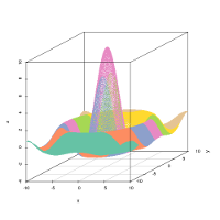
- 3d: similar to the ‘color’ plot, but in 3-dimensions, with x and y the coordinates of the grid and z the value of the prototypes or observations for the considered variable.
- boxplot: plots boxplots for the observations in every neuron.
- lines: plots a line for each observation in every neuron, between variables.
- barplot: similar to lines, here each variable value is represented by a bar.
- mealine: plots, for each neuron, the prototype value or the average value level of the observations, with lines. Each point on the line represents a variable.
- names: prints on the grid the names of the observations in the neuron to which they belong. Warning! If the number of observations or the size of the names is too large, some names may not be representedthey are reprensented in the center of the neuron, with a warning.
- poly.dist: represents the distances between prototypes with polygons plotted for each neuron. The closer the polygon point is to the border, the closer the pairs of prototypes. The color used for filling the polygon shows the number of observations in each neuron. A red polygon means a high number of observations, a white polygon means there are no observations.
- smooth.dist: depicts the average distance between a prototype and its neighbors using smooth color changes, on a map where x and y are the coordinates of the prototypes on the grid. If the topology is hexagonal, linear interpolation is done between neuron coordinates to get a full squared grid.
- umatrix: is another way of plotting distances between prototypes. The grid is plotted and filled colors according to the mean distance between the current neuronand the neighboring neurons. Red indicates proximity.
- grid.dist: plots all distances on a two-dimensional map. The number
of points on this picture is equal to:
number_of_neurons * (number_of_neurons-1) / 2
The x axis corresponds to the prototype distances, the y axis depicts the grid distances. - MDS: plots the number of the neurons according to a Multi Dimensional Scaling (MDS) projection on a two-dimensional space.
Plots in the SuperClasses panel: the plot options are mostly the same as the ones listed above, but some are specific:
- grid: plots the grid of the neurons, grouped by superclasses (color).
- dendrogram: plots the dendrogram of the hierarchical clustering applied to the prototypes, along with the scree plot which shows the proportion of unexplained variance for incremental numbers of superclasses. These are helpful in determining the optimal number of superclasses.
- dendro3d: similar to 'dendrogram', but in three dimensions and without the scree plot.
Plots in the 'Combine with external information' panel: the plot options are mostly the same as the ones listed above, but some are specific:
- pie: requires the selected variable to be a categorical variable, and plots one pie for each neuron, corresponding to the values of this variable.
- words: needs the external data to be a contingency table or numerical values: names of the columns will be used as words and printed on the map with sizes proportional to the sum of values in the neuron.
- graph: needs the external data to be the adjacency matrix of a graph. According to the existing edges in the graph and to the clustering obtained with the SOM algorithm, a clustered graph is built in which vertices represent neurons and edge are weighted by the number of edges in the given graph between the vertices affected to the corresponding neurons. This plot can be tested with the supplied dataset Les Miserables that corresponds to the graph those adjacency table is provided at this link.
The show cluster names option in the 'Plot map' panel can be selected to show the names of the neurons on the map.
The energy option in the 'Plot map' panel is used to plot the energy levels of the intermediate backups recorded during training. This is helpful in determining whether the algorithm did converge. (This option only works if a 'Number of intermediate backups' larger than 2 is chosen in the 'Self-Organize' panel.)
Use the options on the dedicated panel to group the prototypes of a trained map into a determined number of superclasses, using hierarchical clustering. The 'dendrogram' plot can help you to choose a relevant number of superclasses (or equivalently a relevant cutting height in the dendrogram).
Plot external data on the trained map on the dedicated
panel. If you have unused variables in your dataset (not used to train the map),
you can select them as external data. Otherwise, or if you want to use other data,
the external data importation process is similar to the one described in
the 'Data importation' section, and the available
plots are described in the 'types of plots' section.
Note that this is the only panel in which factors can be plotted on the
self-organizing map. For instance, if the map is trained on the first four
(numeric) variables of the supplied iris dataset, you can select the species variable and plot the iris species
on the map.